 Docs
DocsUnderstanding Data Dashboards in Data Analysis
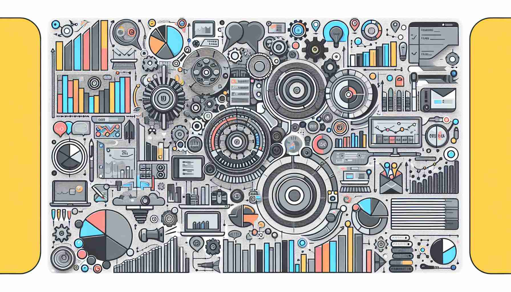
Data Dashboard Briefly Summarized
- A data dashboard is a graphical user interface that displays key performance indicators (KPIs) and metrics to provide an at-a-glance view of an organization's performance.
- Dashboards are essential for tracking, analyzing, and displaying data, often in real-time, to assist in decision-making and strategy evaluation.
- They are commonly accessible via web browsers and are linked to data sources that regularly update to reflect the most current information.
- Data dashboards are widely used in various sectors, including business, healthcare, and government, with examples like Google Analytics and COVID-19 trackers.
- The design and functionality of a dashboard can greatly influence its effectiveness in conveying information and enabling users to interact with data.
In the realm of data analysis, a data dashboard stands as a pivotal tool that encapsulates complex data into a comprehensible and actionable format. This article delves into the intricacies of data dashboards, their significance, components, and the best practices for their creation and utilization.
Introduction to Data Dashboards
The term "dashboard" finds its roots in the automotive industry, referring to the panel that allows drivers to monitor the essential functions of a vehicle at a glance. Similarly, in the business and data analysis context, a data dashboard is a visual interface that presents critical information succinctly and accessibly. It is designed to enable users, from business executives to data analysts, to grasp complex data sets quickly and make informed decisions.
The Essence of Data Dashboards
Data dashboards are more than just a collection of charts and graphs; they are a synthesis of data storytelling and user experience. They provide a narrative that guides the viewer through the most important aspects of the data, highlighting trends, outliers, and patterns that might not be immediately apparent. The user experience is also paramount, as a well-designed dashboard allows for easy interaction with the data, enabling users to drill down into specifics or zoom out for a broader perspective.
Components of a Data Dashboard
A typical data dashboard comprises several key elements:
- Key Performance Indicators (KPIs): These are the metrics that matter most to the organization and are prominently featured on the dashboard.
- Visualizations: Graphs, charts, and other visual tools are used to represent data in an easily digestible format.
- Filters and Controls: These allow users to customize the view of the data, focusing on specific time frames, departments, or other relevant segments.
- Data Sources: The dashboard is connected to various data sources that feed it with real-time or periodic updates.
- Interactivity: Features such as tooltips, clickable elements, and drill-down capabilities enhance the user's ability to interact with the data.
The Role of Dashboards in Decision Making
Dashboards serve as a bridge between raw data and actionable insights. They filter out the noise and present only the information that is necessary for decision-making. This is particularly important in today's fast-paced business environment, where data-driven decisions need to be made swiftly and confidently.
Designing an Effective Data Dashboard
Creating an effective data dashboard requires a thoughtful approach that considers the end-user's needs and the objectives of the organization. Here are some best practices:
- Simplicity: Avoid clutter and focus on what's important. Too much information can be overwhelming and counterproductive.
- Relevance: Tailor the dashboard to the audience. Ensure that the KPIs and metrics displayed are relevant to the viewer's role and objectives.
- Accessibility: Design for ease of use. The dashboard should be intuitive and require minimal training to understand.
- Visual Hierarchy: Use design elements to guide the viewer's attention to the most critical data first.
- Responsiveness: Ensure the dashboard is accessible on various devices, adapting its layout to different screen sizes.
Common Dashboard Tools and Technologies
There are numerous tools available for building data dashboards, each with its own set of features and capabilities. Some popular options include:
- Microsoft Power BI: A comprehensive business analytics tool that enables users to create interactive dashboards and reports.
- Google Analytics Dashboards: Widely used for tracking website performance, offering customizable widgets to display various metrics.
- Tableau: A powerful data visualization tool that allows for the creation of detailed and interactive dashboards.
- Qlik: Offers associative analytics engines, sophisticated AI, and scalable multi-cloud architecture to empower users to create and explore dashboards.
Dashboards in Action: Real-World Examples
Dashboards have been instrumental in various sectors:
- Business: Companies use dashboards to monitor sales performance, customer engagement, and operational efficiency.
- Healthcare: Dashboards track patient outcomes, hospital performance, and resource allocation.
- Government: Public dashboards display data on everything from budget allocation to public health statistics, as seen with COVID-19 trackers.
Conclusion

Data dashboards are indispensable tools in the arsenal of data analysis. They transform raw data into strategic insights, guiding decision-makers through the complexities of their organization's performance. A well-crafted dashboard not only informs but also empowers users to take data-driven actions that can steer an organization towards its goals.
FAQs on Data Dashboards
Q: What is a data dashboard? A: A data dashboard is a visual interface that displays key performance indicators (KPIs) and metrics to provide a quick overview of an organization's performance.
Q: Why are data dashboards important? A: Data dashboards are important because they allow for real-time monitoring and analysis of data, which supports informed decision-making and strategy evaluation.
Q: What are some common features of a data dashboard? A: Common features include interactive charts and graphs, customizable filters, real-time data updates, and user-friendly interfaces.
Q: Can data dashboards be customized for different users? A: Yes, dashboards can and should be customized to meet the specific needs and objectives of different users within an organization.
Q: What tools can be used to create a data dashboard? A: Tools like Microsoft Power BI, Google Analytics, Tableau, and Qlik are commonly used for creating interactive and informative data dashboards.
Sources
- Dashboard (business)
- What Is a Data Dashboard | Microsoft Power BI
- What Is A Data Dashboard? Definition, Meaning & Examples
- What is a Data Dashboard? Definition and 15 Key Examples - Qlik
- What is a Data Dashboard? Definition, Benefits, and Examples
- What Is a Data Dashboard? | Klipfolio
- What Is a Dashboard? Everything You Need to Know - ThoughtSpot
- How to build a data analytics dashboard: A step-by-step guide
- Data dashboard | Better Evaluation
- What is a Data Analytics Dashboard? - HEAVY.AI