 Docs
DocsData Visualization Tools
Briefly Summarized
- Data visualization tools are software applications designed to represent complex data as graphical charts, graphs, and maps to facilitate understanding and insight.
- These tools support a variety of visual formats such as pie charts, bar charts, scatter plots, and heat maps, often combined in interactive dashboards.
- They cater to a broad audience, enabling non-technical users to comprehend complex data and assisting experts in decision-making and performance monitoring.
- The field incorporates principles from statistics, graphic design, cognitive science, and computer science, making it both an art and a science.
- With advancements in technology, data visualization is becoming more immersive and interactive, enhancing user experience and understanding.
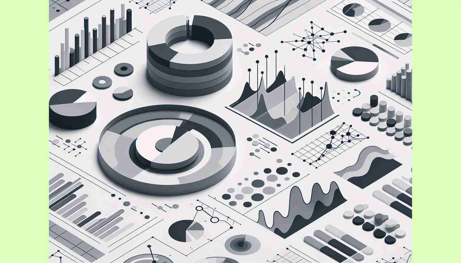
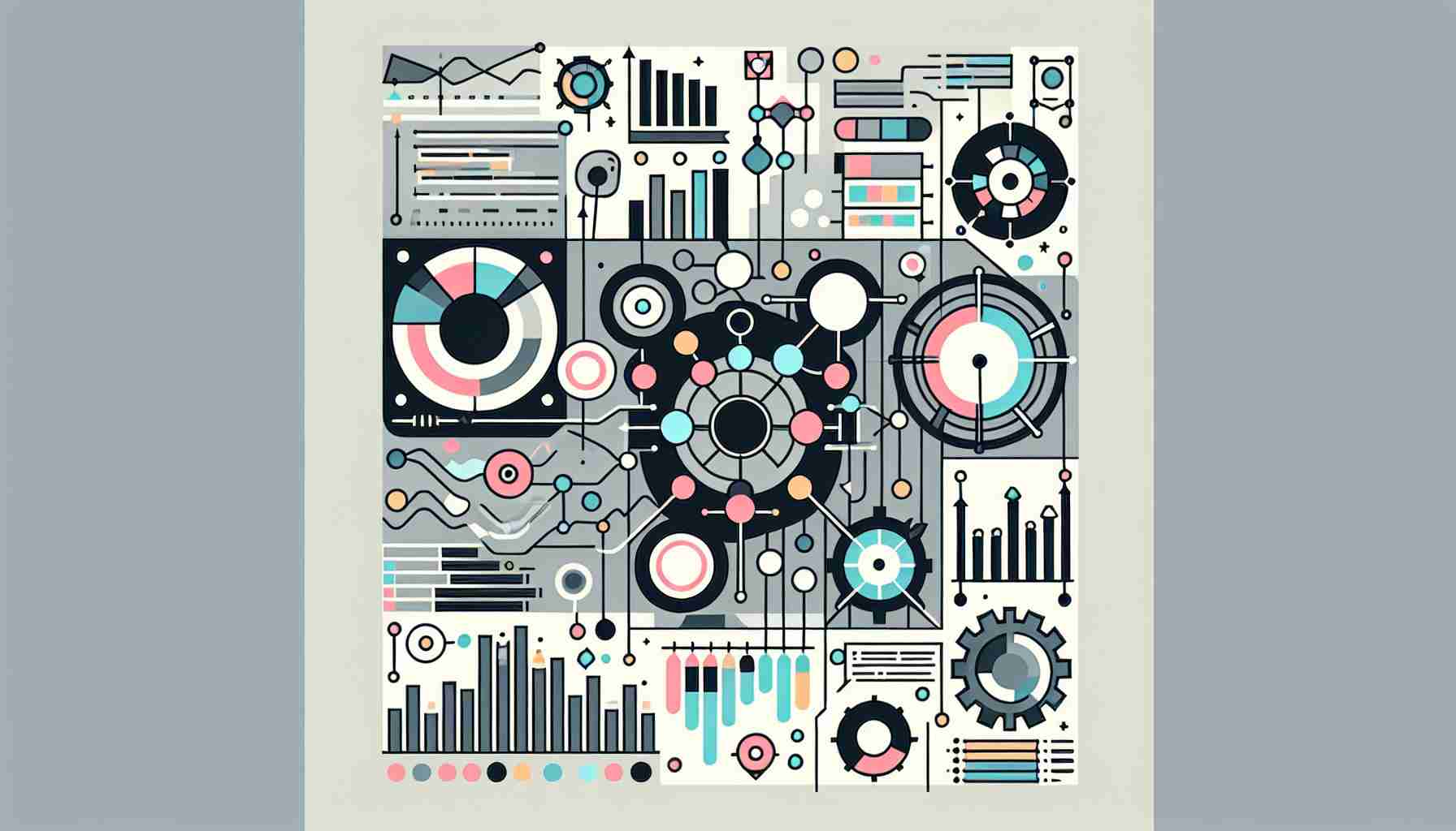
Data visualization tools are essential in the modern era of data analysis. They transform raw data into a visual context, such as maps, graphs, and charts, making the complex information more accessible and easier to understand. This article will delve into the world of data visualization tools, exploring their importance, types, features, and the best practices for their use.
Introduction to Data Visualization Tools
Data visualization is the graphical representation of information and data. By using visual elements like charts, graphs, and maps, data visualization tools help users understand the significance of data by placing it in a visual context. Patterns, trends, and correlations that might go undetected in text-based data can be exposed and recognized more easily with data visualization software.
The power of data visualization tools lies in their ability to provide an accessible way to see and understand trends, outliers, and patterns in data.Types of Data Visualization Tools
There are various types of data visualization tools available, each with its own set of features and capabilities. Some of the most common types include:
-
Business Intelligence Platforms: These are comprehensive tools that include data visualization as part of a larger suite of data analysis and reporting functions. Examples include Microsoft Power BI, Tableau, and Sisense.
-
Open-Source Libraries: For those with programming skills, libraries such as D3.js offer the flexibility to create custom visualizations.
-
Online Data Visualization Services: These tools, like Google Charts and Datawrapper, provide a user-friendly interface for creating visualizations without the need for programming knowledge.
-
Spreadsheet Applications: Tools like Microsoft Excel are widely used for basic data visualization tasks, such as creating simple charts and graphs.
Features of Data Visualization Tools
When selecting a data visualization tool, consider the following features:
- Data Connectivity: Ability to connect to various data sources, including databases, spreadsheets, and cloud services.
- Visualization Types: A wide range of visualization options, such as bar charts, line graphs, heat maps, and more.
- Interactivity: Tools that allow users to interact with the data, such as filtering, drilling down, and zooming in on specific details.
- Customization: Options to customize the appearance of visualizations to match branding or highlight specific data points.
- Collaboration and Sharing: Features that enable users to share visualizations with others and collaborate on data analysis.
Best Practices for Data Visualization
To create effective visualizations, consider the following best practices:
- Understand Your Audience: Tailor the complexity and design of your visualization to the knowledge level and needs of your audience.
- Keep It Simple: Avoid clutter and focus on presenting the data in a clear and concise manner.
- Use Color Effectively: Color should be used purposefully to highlight important data points or to distinguish between different data sets.
- Provide Context: Always include labels, legends, and annotations to ensure that the viewer understands the data being presented.
- Ensure Data Accuracy: The visualization is only as good as the data behind it. Verify that the data is accurate and up-to-date.
Conclusion
Data visualization tools are a cornerstone of data analysis, providing a bridge between complex data sets and the people who need to understand them. They empower users to identify patterns, trends, and insights that can inform decision-making and strategy. As technology continues to evolve, these tools will become even more sophisticated, offering greater interactivity and immersive experiences.
FAQs on Data Visualization Tools
Q: What are data visualization tools? A: Data visualization tools are software applications that allow users to create visual representations of complex data sets to facilitate understanding and analysis.
Q: Why are data visualization tools important? A: They help to quickly convey complex data in an understandable format, making it easier for individuals to identify trends, patterns, and insights.
Q: Can non-technical users utilize data visualization tools? A: Yes, many tools are designed with user-friendly interfaces that do not require advanced technical skills.
Q: What are some popular data visualization tools? A: Popular tools include Microsoft Power BI, Tableau, Google Charts, D3.js, and Datawrapper.
Q: How do I choose the right data visualization tool? A: Consider factors such as the types of data you're working with, the level of customization you need, the tool's ability to connect to your data sources, and the complexity of visualizations you want to create.
Sources
- Data and information visualization
- A Complete Overview of the Best Data Visualization Tools - Toptal
- The Best Data Visualization Tools Of 2024 – Forbes Advisor
- 8 best data visualization tools to use in 2024 - ThoughtSpot
- Top Data Visualization Tools for Business Professionals
- Your Guide to the Top 11 Data Visualization Tools - Kinsta
- 10 Best Data Visualization Tools for Projects for 2024 | ClickUp
- What Is Data Visualization? Definition & Examples | Tableau
- The Best Data Visualization Tools - PCMag
- Flourish | Data Visualization & Storytelling